Redesigning Podcast Ad Inventory Search
Background
The Sales Availability Search (SAS) was Flightpath’s first major interface feature—embedding our predictive AI directly into the user experience. Designed to deliver real-time forecasting for podcast ad inventory, SAS became a critical tool for ad sales teams, but its interface remained frozen in time as the rest of the platform evolved.
A third-party update forced us to revisit the tool—but instead of simply patching it, we saw a chance to rebuild from the ground up. The result is a reimagined SAS: intuitive, modular, and fully aligned with our design system. It’s now a core driver of user engagement and client success.
Responsibilities: Product and Interface Redesign, Dev Support
Worked With: Chief Data Officer, CTO, Customer Experience Rep, Developer
Primary Goal: Create a scalable sales inventory search experience that eliminates unnecessary complexity and reduces user error.
Secondary Goal: Update early days feature to match the new design system and experience principles.
Research Methods
Because we were redesigning an existing feature, we were able to draw upon a wealth of Mixpanel data and the customer feedback that our CX team had collected over the years. In addition to this, I conducted one on one interviews and tests of the current system with 4 users who use SAS as a part of their daily workflow.

Mixpanel data showed that most of our users were only using the required parameters.
Interviews identified that style and font inconsistencies were making it unclear which fields were required.
One of the most frequent concerns reported by our CX team was that clients didn’t understand what the optional fields actually did, leading to misinterpreted results and, in some cases, completely incorrect conclusions.

A long-standing bug would clear all of the search parameters if they hit the back button, a frustration that came up regularly in CX calls.
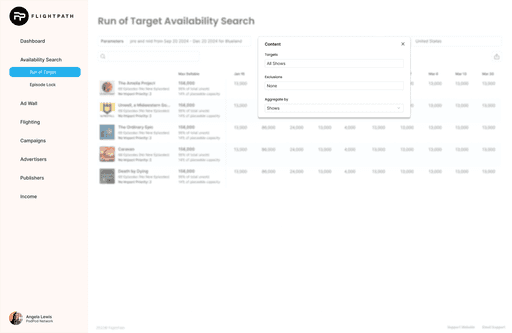
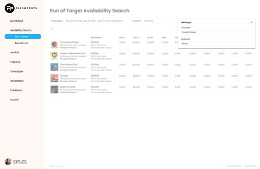
User interviews revealed that many users wanted to modify parameters directly from the results page, allowing for quicker adjustments while still referencing the data table.
Problem Statement
Our users need a more intuitive and resilient way to adjust search parameters in the Sales Availability Search tool.
The existing input form is confusing and rigid and users struggle to understand which fields are required, what optional parameters do, and how their choices impact results.
Once a search is submitted, making changes is cumbersome: parameters can only be adjusted from a single location, and navigating away clears all progress. This workflow not only creates friction for quick iteration but also increases the risk of incorrect or misinterpreted data, undermining trust in the tool and slowing down critical ad sales decisions.
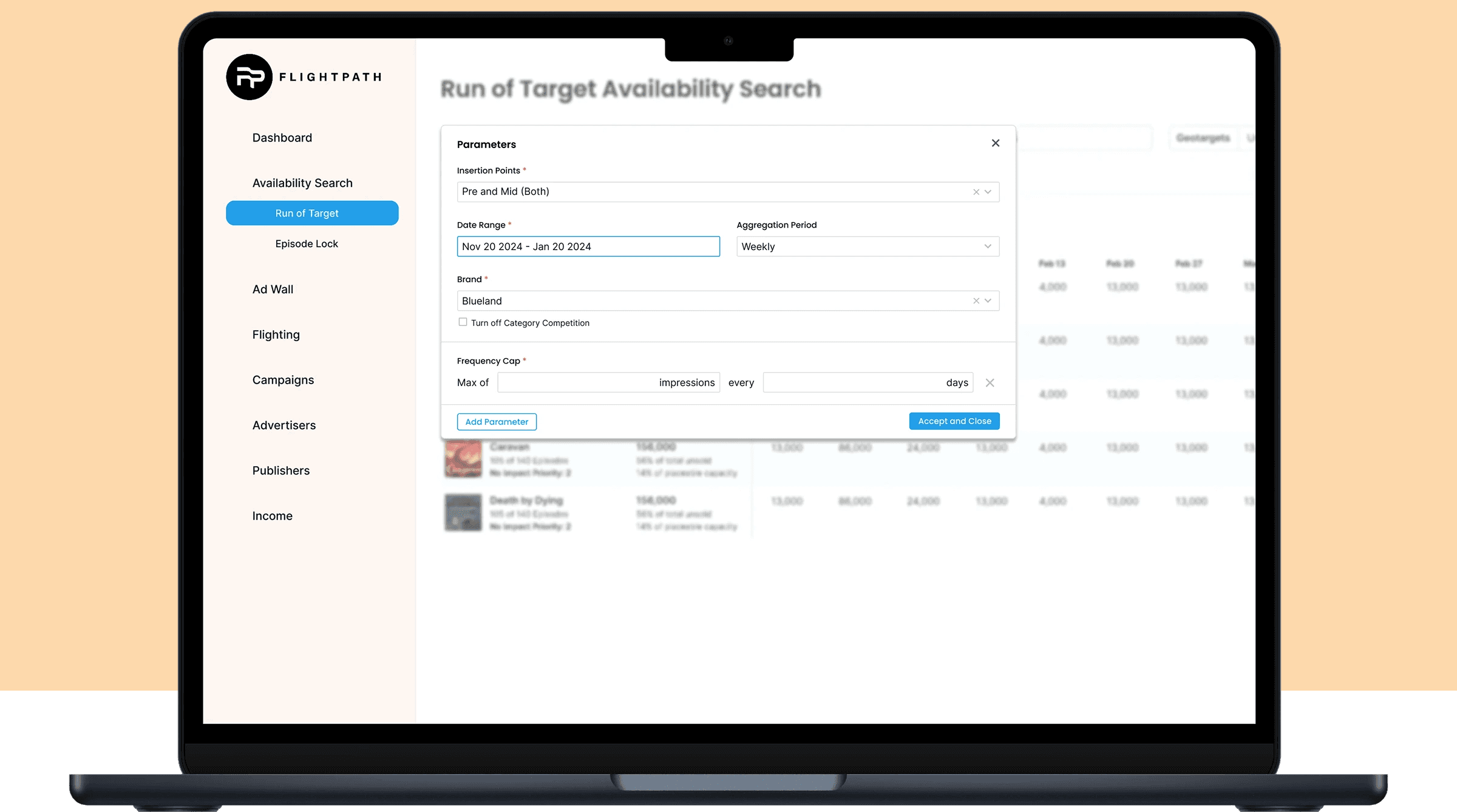
Design Solution #1: Modular Parameter Input Form
A modular parameter input form hides the optional parameters that are only being used by our power users.

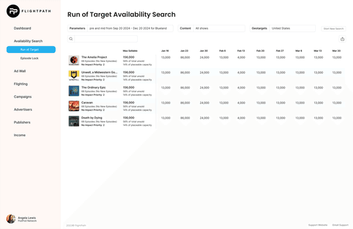
Design Solution #2: A New Affordance on the Results Page
A new row about the table doubles as confirmation of what the user is looking at and as an affordance to make parameter adjustments.


Testing
I brought high fidelity prototypes of our design to a group of 10 users, to test wether adding and changing parameters in the new design was both intuitive and understandable. The prototype was built with Figma variables so that it would give users the opportunity to choose any path they wanted too. We ran the test with Maze to capture misclicks and user path data, and followed the Maze up with a brief interview.
100% of users successfully added the geotarget module to filter availability to the United States—demonstrating the form’s intuitive design for common use cases.
100% of testers completed a power user task by adding the position module, proving that even advanced workflows are accessible.
2 out of 10 testers relied on intuition rather than concrete knowledge to use the position module correctly—highlighting an opportunity for better guidance on ad placement logic.
100% of users said they would feel confident using the feature in the future, confirming that the UI empowers users without creating barriers to learning more advanced ad tech concepts.
This test validated our core design philosophy: The interface doesn’t limit beginners, but it scales seamlessly as users gain expertise.
This redesign became our most positively received release to date. Clients who had previously avoided SAS have now migrated their workflows entirely to Flightpath, leading to massive efficiency gains and significantly improved sell-through rates. Early usage data shows a clear boost in engagement, and client feedback has been overwhelmingly enthusiastic.
This project was a highlight of my time at Flightpath. It was deeply rewarding to draw on two years of feedback and data to reshape an essential tool. Revisiting my earlier work also underscored how much I’ve grown as a designer—particularly in anticipating edge cases and scaling complexity with clarity. I’m excited to keep evolving.
© 2025 Will Peterson
About